
Primary Bedroom and Bath
Executive summary: I thought our condo’s primary bedroom and bathroom were already unnecessarily large, but these ones in the duplex sure take the cake.
Two homes back (which was only one year ago!), we were voluntarily living in a 1-bedroom apartment with 2 kids. We gave the kids the bedroom and put our bed in the living room, as we did back in our college studio apartment days. It worked just fine. When we moved into our condo, I lamented how much space we had in a bedroom of our own — I had to purchase multiple items to fill it up (dressers, lamps, floor mirror, armchair), or else it would’ve sat awkwardly half empty. Now all those items are being distributed to other rooms in our new house, and I’ve started yet again from almost scratch in our even bigger primary bedroom. This one even has a “retreat,” which boggles my minimalist mind. I suppose it could be an office or a home gym, but we don’t really need either of those things. Before I explain how I designed our primary suite, let’s see a picture that might be worth a thousand words:
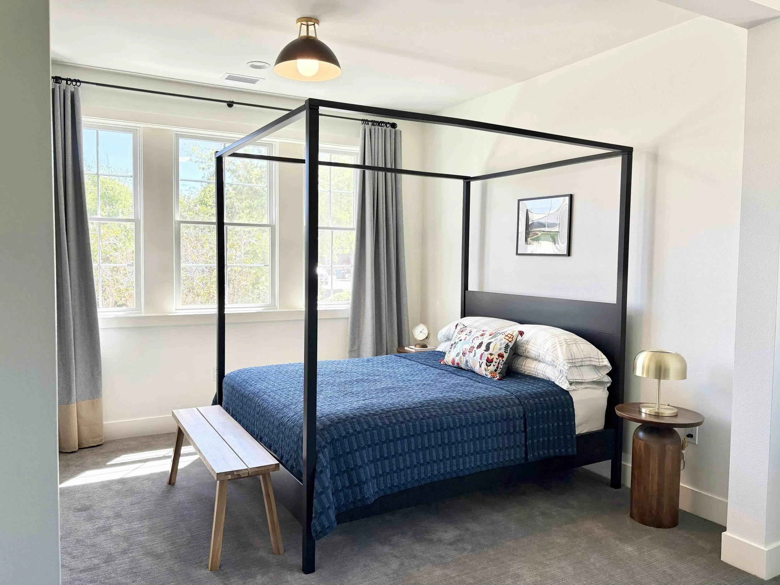
Bed frame: IKEA | Pillowcases: Crate & Barrel | Bedsheet: Parachute | Bedspread: IKEA | Throw pillow: IKEA | Art: DIY (frame from Amazon) | Pedestal side tables: World Market | Table clock: Target | Table lamp: Article | Acacia bench: IKEA | Semi-flush mount light: Crate & Barrel | Curtain rods: Rejuvenation | Curtains and rings: IKEA
I wanted to make a big statement in the sleeping area, to stand up to the size of the room (which has 9-foot ceilings). Even in our condo, I had thought that a canopy bed could be the focal point to define the room, but I put off that purchase, given that I was planning on ceding the primary bedroom to one of the kids in a few years when they stopped sharing a room. So I decided that I would take the opportunity with this move to finally upsize to a canopy bed to add the appropriate drama to a large bedroom. We went with the reasonably affordable YTTERVÅG from IKEA ($599 for a queen), and I’m pleased with how it visually fills out this room. As to not compete with the bed, I kept the light fixture simple (a semi-flush mount instead of an eye-catching pendant light) and the nightstands small (two unassuming pedestal side tables). I embraced the power of asymmetry with the styling: I splurged (by my definition) on a nice table lamp for one side and kept our budget table clock on the other. High and low, old and new, big and small — the variety is what makes a space interesting.
Let me tell you a bit about the curtains. Unless you go custom (cha-ching!), it is hard to find long curtains beyond 96”. IKEA does 98” (probably for metric conversion reasons), but even those are not long enough to suit our 9’ ceilings. In our condo with 8.5’ ceilings, I had my mom sew a hem to lengthen our curtains last year (full post here), but that wouldn’t be sufficient this time to get the curtains to reach the floor. So I decided to go with a color-blocked pattern that meant we literally sewed two curtains together to elongate each panel. I originally wanted the beige color on top and the gray on the bottom, but the beige panels are only “room darkening” while the gray panels are “blackout” — this distinction is very important to ensure our best beauty rest! But now I realize that putting beige on the bottom was the better choice stylistically too: given that the carpet is gray, a gray curtain ending with gray carpet would’ve looked like the curtains were melting into the floor. The beige breaks up all the gray, and the only question was how much of it we should have. I settled on approx. one foot of beige at the bottom, but we could’ve as easily opted to bring it all the way up to the window sills (which is what my parents were suggesting when they helped us hack these curtains). We probably saved $1-2k by DIYing IKEA curtains (the ROSENMANDEL were $15 a panel) instead of buying custom extra-long ones (which would’ve been hundreds of dollars each). The two walls of windows in the primary bedroom and retreat are so wide (100” across) that we needed 2 sets of curtains (4 panels) to cover each. The rule of thumb is that your curtains should be twice as wide as your window, as to not look weirdly stretched flat when closed, so each side is actually two 53”-wide panels attached together by small binder clips on the back. That was the easiest way to make the curtains look full. Thank you to my mom and her sewing machine (and my dad the chauffeur) for helping me cobble it all together!
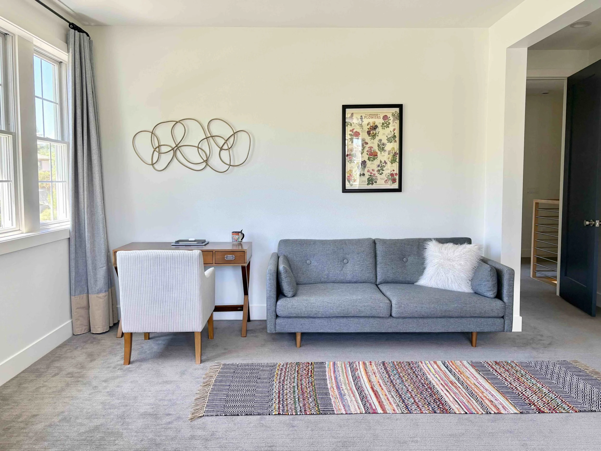
Desk: Target | Chair: Target | Wall sculpture: Amazon | Sofa: Article | Throw pillow: Crate & Barrel | Picture: DIY (poster from Paper Source, frame from Michael’s) | Chindi rug: World Market
I mentioned the retreat above — now let’s take a look! In contrast to the sleeping area, this space is filled with items we already had; the only new addition is the flower poster above the sofa. This was a case of playing “furniture musical chairs” and figuring out how best to arrange our existing pieces in a new home. There is so much space in this room that I decided to bring our former living room sofa in here, to truly make it a place for us to “retreat” (i.e., hide) from the kids. The wall would’ve looked better, IMO, if I’d filled it with a unifying decor feature like a picture ledge that spans the entire length of the wall. But my minimalist sensibilities won out here — I didn’t want to acquire yet more art to properly fill out such a ledge, plus dusting would have been a pain. Function > form for this minimalist, although I strive to achieve both.
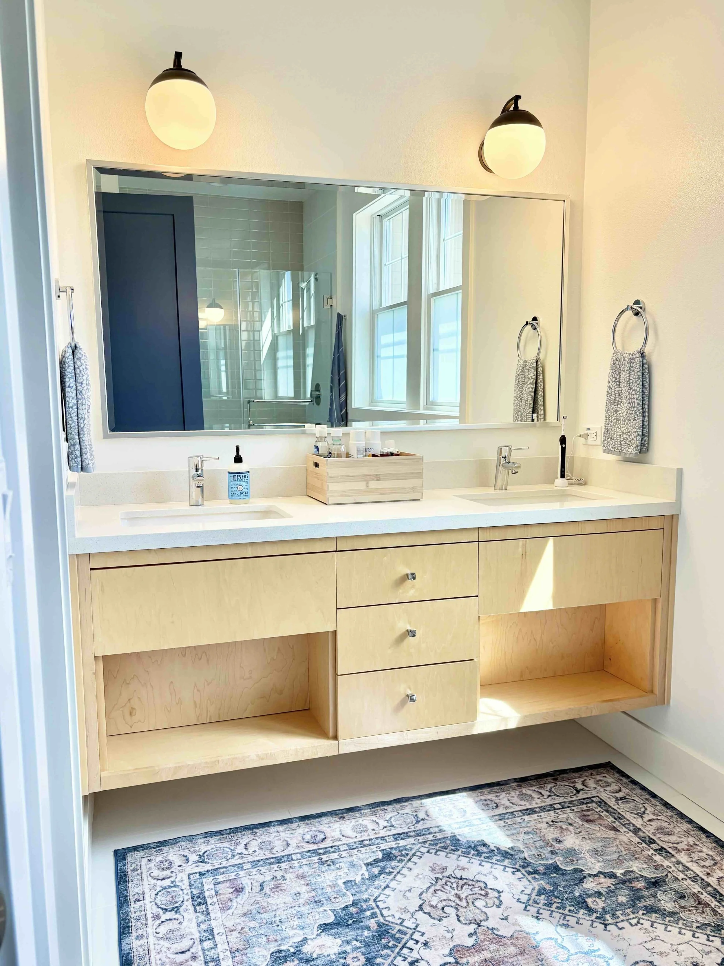
Wall sconces: Shades of Light | Bamboo box: IKEA | Hand towels: Target | Rug: Costco
The last part of this post covers the primary bathroom. I was not psyched about the big expanse of white tile floor in here. I prefer a floor with a pattern so I don’t see every single stray hair taunting me, which makes me feel like I need to wipe up 4x a day. I’m not allowed to alter the floor under Stanford housing rules, so what’s the solution? A big rug to cover up the unforgiving floor, and feel luxurious on our bare feet to boot! It was actually a happy accident that led me to this epiphany: I was originally looking for a runner to place in front of the sinks, but had this 5’x7’-ish rug from the condo that needed a home. Turns out it’s a perfect fit, plays nicely with the color of the blue-gray doors, and is machine-washable too, which means it can withstand water. Such serendipity!
My other issue with this bathroom is the lack of storage in the vanity. I dislike these open-shelf designs because I want to throw ugly toiletries and toilet paper under my sink. I didn’t feel like hanging an under-counter skirt, nor did I want to style a hole in my vanity, so these are just staying empty (very minimalist of me). I use the drawers sparingly, as they aren’t tall enough to be functional for a lot of things, and corralled our daily use items in a bamboo box on the counter. I don’t love it, as the garish packaging is still visible, but it’s much better than scattering everything all over the counter or pulling open those little drawers repeatedly every day to access items (which I did try for the first week of living here). So as much as the big rug worked out so well, this part of the bathroom did not, but you win some, you lose some. And obviously, with this house in general, we’ve won (the faculty housing lottery) big time, so I will stop my griping here. =)