
Dining Room and Kitchen (previous)
Update March 2026: This is a tour of our previous home. The current one is also posted under Peek at our Pad – the dining room and kitchen can be found here.
Executive summary: I like to keep my surfaces as bare as possible for fast cleaning (soooo important with kids), so the dining room and kitchen are full of functional decor that makes it easy to grab what we need while not unnecessarily creating clutter.
Here I go again, changing up our dining room when I thought I’d finally nailed down a style I’d stick with for a long time, relatively speaking (I wrote a whole post on the “evolution” of our last dining room here). But as much as I liked our Saarinen-style tulip table (although I disliked having to clean that hefty base), we needed something bigger now that the grandparents are visiting us on a regular basis. The jury is still out on the new table because we just got it, and it’s heavy on the farmhouse vibes, but I don’t think it’s incongruous in our space. The Thonet bentwood-inspired chairs I adore, and bought an extra set now that we can comfortably seat 6-8 around the table. The centerpiece is very simple and functional – the bowl holds fruit that we eat every day, and I don’t want it to compete with the light fixture, so keeping a (literal) low profile works here. Speaking of the light fixture, the one I picked has become a favorite of the entire family (we dubbed it the “moon light”), and especially when combined with the expansive windows, allows me to keep the rest of the decor quite minimal. You could imagine this room with a bar cart, or a table runner, or a rug to define the space, but I prefer to be able to wipe the surfaces without having to maneuver around extra stuff … crucial for my sanity when I’m on my hands and knees here at least twice a day cleaning up after the kids. It always makes me wonder: how does anyone manage a rug in the dining area with kids?? There was carpet in the dining room when I was growing up, and I don’t understand how my parents weren’t following me around with a vacuum every waking moment. Please let me in on the secret if I’m missing something.

Table: Target | Chairs: Target | Highchair: Stokke | Bowl: HomeGoods | Wall clock: Target | Curtain rods: Rejuvenation | Curtains and rings: IKEA | Moon pendant light: Crate & Barrel | Canvas print: Minted
I’ll take a moment to discuss the wraparound windows in the dining room. While it’s great to have the light and the views, our move into the condo would’ve been 10% easier for me if the windows were spaced apart at the corner (as opposed to basically connected). The reason is that it’s apparently so hard to find attractive corner connectors for the curtain rods! There isn’t any space to have two separate rods – they would collide in the corner – so I needed corner connectors to essentially create one long rod that turns 90 degrees. I only came across two options for corner connectors, one higher-end and one lower-end, and the lower-end one wasn’t meeting my aesthetic standards. So I splurged on the nice Rejuvenation rods (“splurge” is subjective, as the rods were $200-$300 each, depending on length, which I’m sure some people think is absurd and others perfectly reasonable). I do like them, especially as I wanted to try a French return rod (where it curves into the wall at the ends), and I also like how slim they are (0.75” diameter). So I’m not complaining about the outcome, just the process that was complicated by that corner situation.

That corner window caused me quite a bit of consternation!
Pivoting around, we move into the kitchen. I admit this is a space that I would’ve designed differently had Stanford Faculty Housing allowed it, but I’ll try to not sound too whiny. I mainly take issue with the blank white wall, as we’re not allowed to put up any backsplash, but at least we have that window tucked beneath the cupboards to break up what otherwise would’ve been a long stretch of boring wall. I also don’t care much for the glossy white upper cupboards (and they were quite dirty when we bought the place – I literally had to stick a toothpick into all the crevices to scratch the grime out, which was accentuated by the shiny white). It’s not the kitchen of my design dreams, but it does offer ample storage and counter space. I could’ve styled out the counters a lot more to make up for the bare walls, but that would be anti-minimalist. So I kept it to the marble paper towel holder, 2-tier dish drying rack (see post on it here), the white pitcher (which was the centerpiece of our previous, much smaller dining room table) that now holds the cooking utensils, and the bowl of toddler munchies, which I like to keep handy on the island as said toddler is always asking for something from that stash during meals (I wrote a post on the kids’ picky eating habits here). And of course, no kitchen of mine would be complete without our travel magnets on the fridge. Kitschy? Maybe. But I don’t care – they have established themselves in our home beginning with the first international trip my husband and I took together, a “post-college graduation and pre-wedding jaunt through Europe.” Since then, we’ve greatly grown our collection and I have no intention of hiding it away, no matter if it’s design heresy or not. (Update 11/15/25: I upgraded the boring white pendant lights over the kitchen island to blue ones that add more color and style to this not-kitchen-of-my-design-dreams – full post here.)
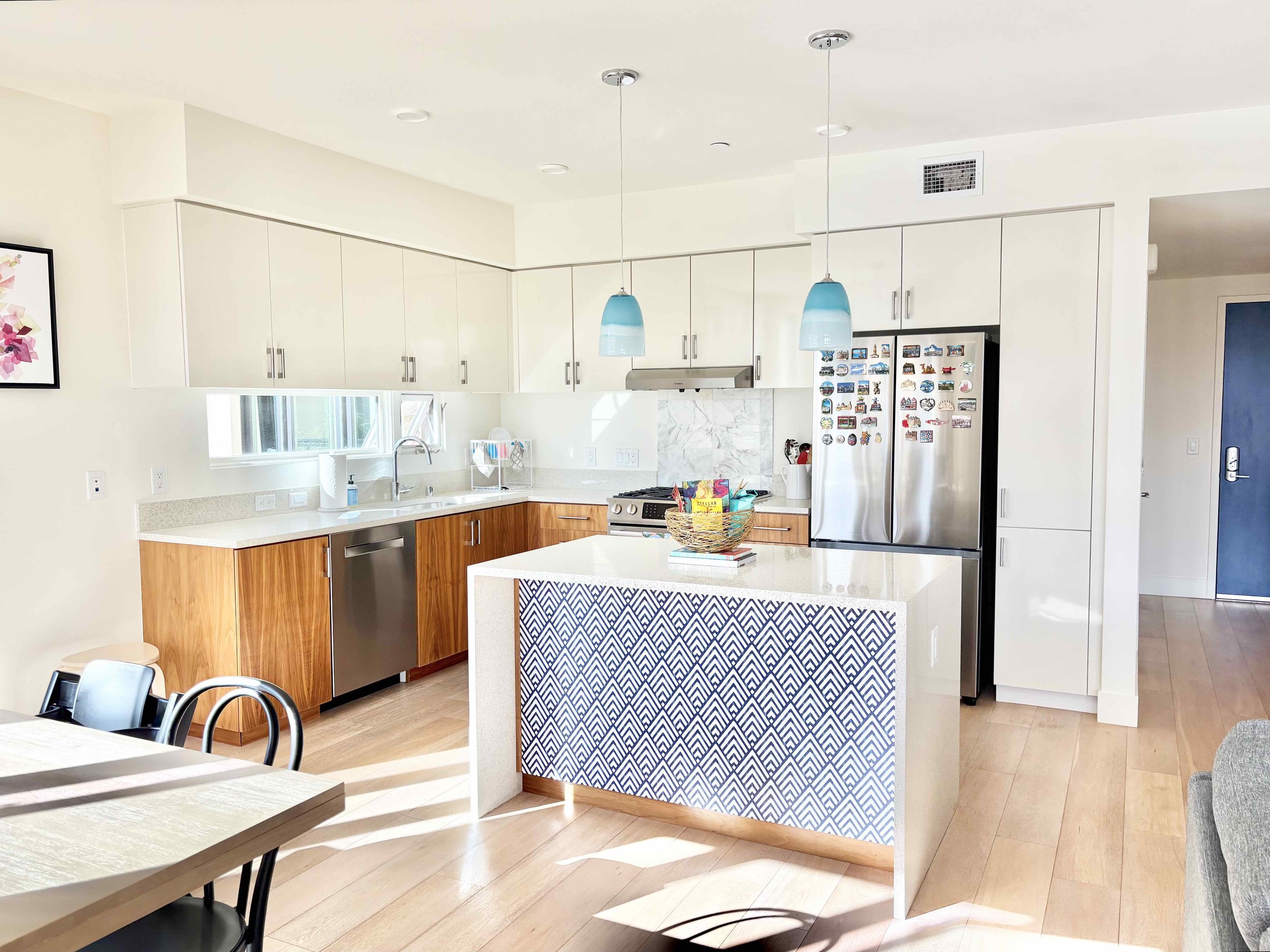
Marble paper towel holder: Crate & Barrel | Dish rack: Yamazaki Home | Gold bowl: HomeGoods | Water pitcher: HomeGoods | Pendant lights: Shades of Light
I don’t even notice it anymore, but you can see that we have a bar seating area at the kitchen island. We have no use for it as a seating option, so I didn’t bother to get bar stools (remember, nothing extra on the floor!) Maybe it’ll be utilized in the future if our family’s cadence changes, but for now, I basically pretend it doesn’t exist. I toyed with ideas of buying or building a storage shelf or cabinet to fit in the cavern, but we don’t even need the storage space, so I nixed the notion quickly. (Update 6/30/25: I can’t believe I never thought of the island as a place to insert some color and pattern into the kitchen! My mistake has since been rectified with peel-and-stick wallpaper – full post here.) I appreciate that with the waterfall counter, there are no corners jutting out into open space waiting for a clumsy child to stumble too close. I would hate to have to choose between suffering through parental guilt/heart attacks or suffering through ugly corner protectors!