
My Principles of Interior Decorating
3/12/26
Executive summary: As I pull together our new home, I’m employing all the same principles of interior decorating that I’ve cultivated for years now. Some “rules” have been universal for me and establish the right balance in a space, whether it’s one room in a 300-square foot studio or one bedroom in a 2,200-square foot house.
I still can only half believe that we moved twice in under a year. I was happy in our 1,300-square foot condo and had gotten to a place where I was dialed in on the design and layout, when BOOM! We won the Stanford faculty housing lottery for the chance to purchase a 2,200-square foot duplex. We decided to go for it, as the location was prime and the opportunity probably wouldn’t present itself again until the kids were in college (by which time it would be moot), but I wondered how on earth I was going to deal with all that unnecessary space (spoken as a minimalist). My goal was to acquire as few items as possible to fill out our new home, and I have indeed figured out how to make the most of what we have, with only a few more additions (summarized here). I’ve utilized all the same principles of interior decorating in this house as I have in our previous homes, which have ranged from 300 sq ft (a studio in college) to 1,300 sq ft (the condo we just moved from). Below are my basic guidelines for putting together a comfortable, functional, and aesthetically pleasing space, listed loosely in the order in which I think about each of these elements when designing a room:
Tip: First and foremost, cut out the clutter. Rationale: Some people have beautifully layered and collected spaces that just ooze coziness and good taste, but for most of us, too much stuff just looks messy. Designers talk about giving the eye a place to rest, which is hard when there are too many things clamoring for attention. So if nothing else, give your home some breathing room. Examples: Too much furniture crammed into a room; piles of books and papers stacked on top of dining tables; kitchen accessories jostling for space on the counter.
Tip: My next step is to decide on a focal point or statement piece in each room (or zone in a studio), then make sure the other components complement, not compete, with it. Rationale: I want to give the eye a place to rest, on something that instantly draws your attention and makes a big visual impact. Examples: A fireplace, piano, or show-stopping sofa in the living room; a chandelier or special table in the dining room; a dramatic bed, elegant armoire, or eye-catching piece of art in the bedroom.
Tip: Keep everything in a room in line with each other proportionally. Bonus: When in doubt about decor, go big, especially on art and rugs. Big looks bold, small looks scrimpy. Rationale: Sometimes you can pull off a huge bed or sofa in a studio, say, or a small piece of art in a big room, but this can be hard to get right. Disregarding proper proportions can make a room look cheap (unless you’re an artist who can make it look chic instead. My skills have not reached that level yet). Examples: A rug should extend past the sofa by at least 6” on each side; curtains should be hung high and wide around windows, with no ”flood pants” effect; artwork should span approx. two-thirds of the width of the furniture below it.
Tip: Mix up neutral and colorful pieces in a space (although this is just a personal preference). Have a few repeats of each color in a room so it looks intentional and not random. Rationale: To me, this feels calm but still interesting. Too many whites/grays/beiges make a room look washed out, IMO. I feel like I’m looking at a picture with a black-and-white or sepia filter on it and crave something to break the monotony. On the other hand, too many colors everywhere make me feel like I’m standing in a circus (but of course, some spaces can pull off a color explosion well, so this “tip” is quite subjective). Examples: Start with a neutral base like a couch or a bed, then add on colorful hits like pillows, throws, rugs, art, etc.
Tip: Incorporate a variety of textures (e.g., leather vs. fabric vs. metal vs. wood), sizes, shapes (e.g., solid/chunky furniture vs. airy/leggy furniture), patterns (e.g., stripes vs. geometrics vs. florals). Bonus: I’m also careful about making sure my wall decor is varied — if one portion of the wall has a rectangular picture hanging there, the next portion of wall will have something different, like a round mirror or a sculptural piece or a set of pretty hooks. Rationale: Variety is the spice of life! In my parents’ home, everything is a matching set and everything is ALL BROWN. The walls, the floor, the curtains, the furniture. I am being slowly digested inside a giant brown bear. A home looks so much more intentional and interesting when you mix it up. Examples: A dining table and chairs that are different styles; a bed and nightstands that are different shapes or finishes; a couch and accent chair that “speak to each other” but aren’t clones of each other.
Tip: Layer textiles to add instant warmth and coziness to a home. Choose ones that juxtapose well against each other in terms of color, shape, size, etc. Rationale: This is a quick way to make a home look comfortable and welcoming, and provides an opportunity to inject color and pattern (if desired) for visual interest. Examples: Couch pillows that don’t match, but that share a common color scheme; a bed blanket and throw that are totally different textures; a neutral jute rug with a colorful rug layered on top (or vice versa, in my case!)
Tip: Be picky about “fake/imitation” materials. Rationale: Avoid anything that looks obviously fake, because it comes off as cheap and/or tacky. I’m not a snob about my home furnishings (most of it is from IKEA, Target, and the “budget/mass market” category of retailers), but exercise caution. Examples: Fake distressing on “farmhouse” style furniture; an “oil painting” that is a flat print; faux plants that just aren’t convincing.
Tip: If you need storage solutions outside of the closet, I suggest closed storage options. Bonus: If anything will be sitting out in plain sight, ditch plastic in favor of natural materials. Rationale: Unless you are a champion at keeping everything perfectly neat and dust-free all the time (basically impossible with kids), this is the easier way to keep your home looking like it’s under control. Examples: A cabinet with doors instead of open shelving; a storage cubby with bins instead of an open bookcase; woven baskets or wooden boxes instead of plastic containers.
Tip: No garish packaging out in the open. Rationale: Some brands make attractive packaging (e.g., I have Mrs. Meyer’s soap sitting out in every bathroom), but most of it is too distracting to look at every day. Bonus: I don’t do over-the-top character bedding and such with the kids. It’s enough if they have the toys to play with or clothes to wear (be it Bluey or Peppa Pig or whatever they’re into atm), so that their bedroom(s) and playroom don’t look like advertisements for TV shows. Examples: Toothpaste and grooming supplies get corralled in a box under the sink; cereal boxes and food packages are hidden behind an under-the-counter skirt if closed cupboard space is lacking.
Tip: With lighting, make sure your bulbs are a warm hue. Rationale: What you want in a home is the opposite of a cold, commercial office lobby with glaring fluorescent ceiling lights. Homes should be warm and glowy, IMO. I’m fine with having a single ceiling light in a room (I’m too minimalist to complicate my life with “layered lighting”), but my sweet spot (which is not always the easiest to find) are LED bulbs ~1500 lumens (which is bright enough to light up a whole room) and soft white (no glare-y “daylight” colors for us), with an opaque bulb to help diffuse the light (as opposed to clear glass that allows the light to shoot you in the eye).
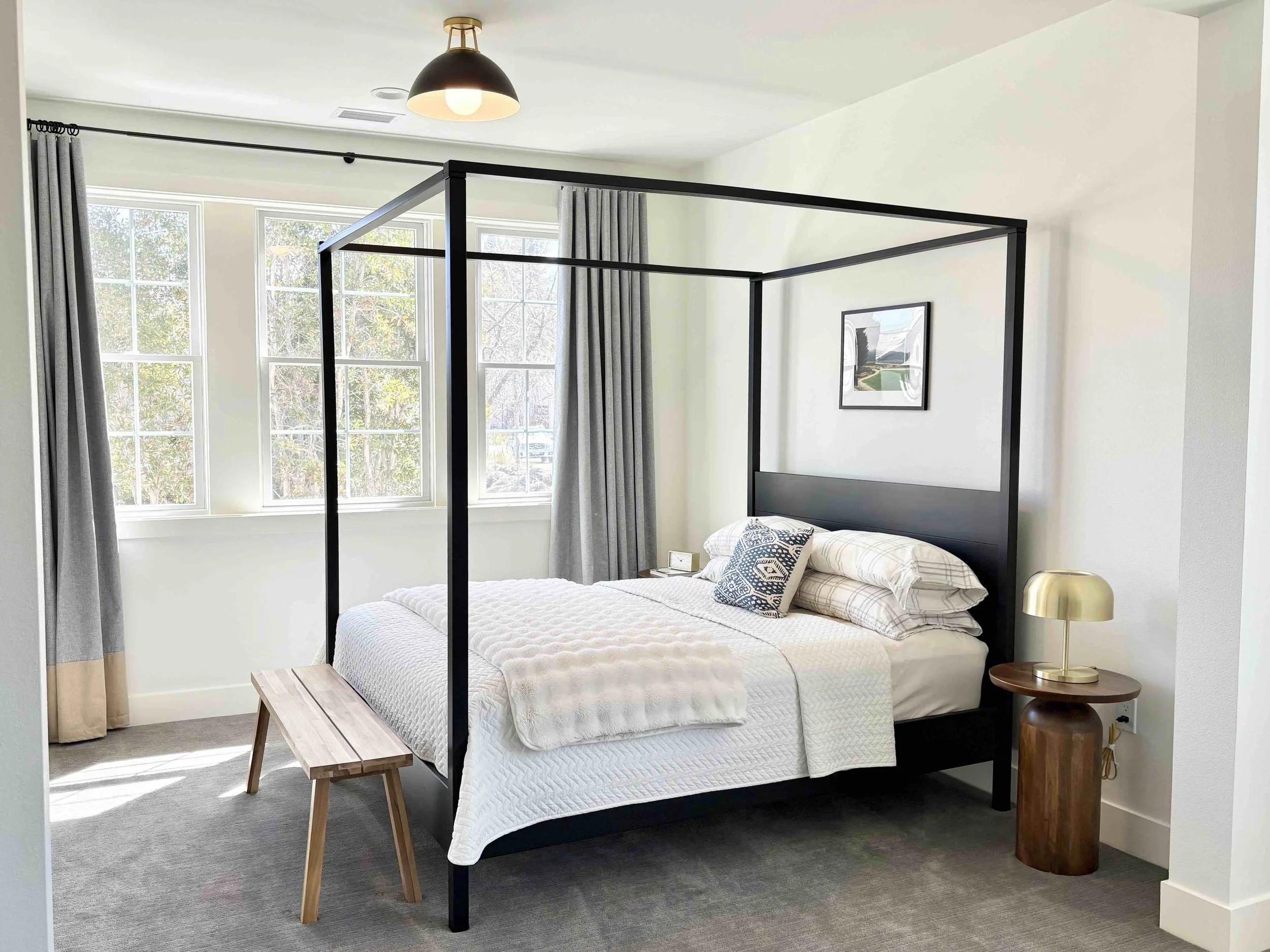
Here’s how our primary bedroom is shaping up (although the most current version can be found here). As a demonstration of tip #2 above, you can see how the canopy bed makes an instant statement, and the other elements in the room are lower profile so as to not compete for attention. Other rules at play are #1 (no clutter), #3 (getting the proportions right — see the high and wide curtains), #5 (variety in color, texture, shape, etc.), #6 (layering textiles), #7 (no atrociously fake-looking materials, even though there’s lots of “non-natural” fibers in here), and #10 (warm lighting).
I’m going to make two final points, which are not “design rules,” but rather my personal approach to pulling together a home:
As I minimalist, I want as many objects in my home as possible to be functional (I compiled a list of ideas here when we moved last time). I do have art that’s just for my viewing pleasure (as opposed to hooks for hanging, trays for corralling, etc), but I prefer items to pull double or triple duty when possible (e.g., stools can be used as extra dining seats or give a boost to reach high shelves or serve as side tables for snacks). Homes are not museums, which is why I don’t do things like shelfies or coffee table styling. If it can’t be touched, it’s a little too precious for me (with certain exceptions, like the kids obviously shouldn’t be shaking the floor lamps, so those are indeed off limits).
I have decided that my signature move is to paint the interior doors. Everyone is always surprised when they see this in our home, even though I thought it’s not that uncommon? One of my childhood homes had buttery beige trim and doors (and ceilings too), which I thought was weird when I was 10, but now I can appreciate the instant warmth it brought to that house. In my own home, I like a bold color that can still be passed off as a neutral in some ways — for me, this has been some shade of blue. A more true blue in the condo and a more gray-blue in the new house. My minimalist sensibilities like this approach because I can cut back on the decor by relying on the doors for visual interest.
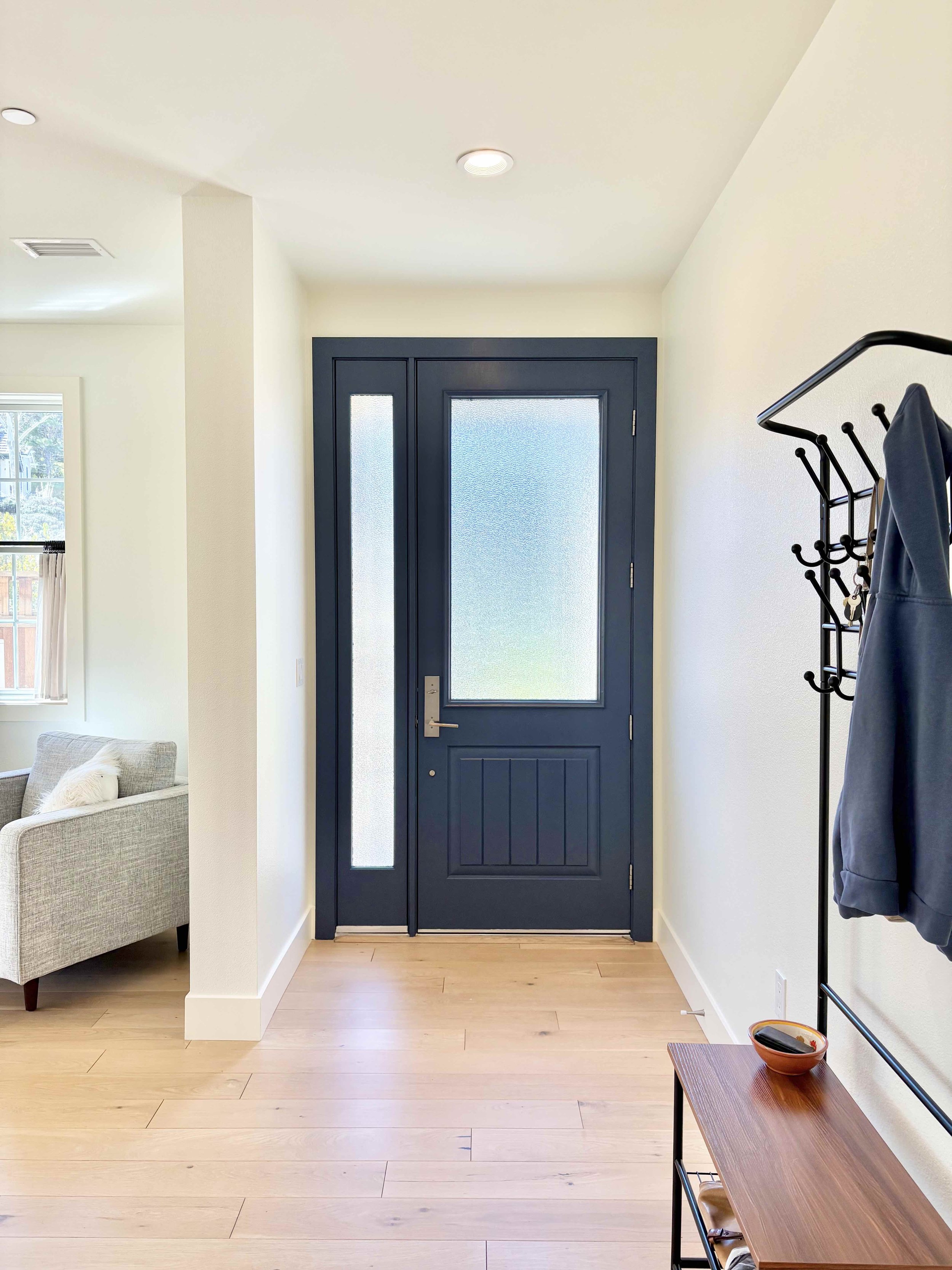
I’m all for the blue hue.
Those are my 10 (or 12) principles of interior decorating that I realize I’ve been employing in every home. I’ve been through countless rounds of trial-and-error (which may never cease), which has taught me a lot about my own tastes and how to create the most streamlined but beautiful home that I can within whatever set of constraints I’m faced with. Before we moved, a neighbor asked to tour our condo, because she wanted to know where I buy all my home goods, and the answer is: nowhere fancy. It’s not about having a big budget or secret sources — it’s about understanding what appeals to you and having a vision in your head of how you want your home to look and function. That does take time: time to contemplate your space, time to search for solutions, time to train your eye (this last aspect took me many years of looking at sooooo many homes on the internet). We are now on the 11th home we’ve lived in since leaving for college and being put in charge of our own decorating decisions 20 years ago, but I would say it wasn’t until our 9th home five years ago that I was able to readily identify my design preferences and principles. This post has been an exercise in making them explicit, which I’ve never done before — my process has always been carried out more subconsciously in my head, so this is my first stab at verbalizing it all!